Dancing Dove Creations

Sunday, February 26, 2006

My First Altered Tins


These tins were created for an altered tin swap on one of the lists I belong to. It's an "odd" art list, hence the saying inside the smaller tin. My 9 yo son had great fun helping me find objects to put in the witchy box. He donated some of his wolf hair collection (yes, really) and several things from his nature collection so that it looked "witchy" enough. Oh, and he raided my herb cabinet as well. Looks like the makings of a decent witch's brew to me!

The "odd" tin was spray painted silver and decorated with permanent marker and some stickers from the Disney line. The inside is lined with leopard print tissue paper. The "witchy" tin was hand painted black with a fairly stiff brush so that it didn't look quite so smooth and new, then the top was decorated with papers and stickers and sprayed with a flat laquer. The inside is lined with a rusty-looking paper.

These are two of my first altered tins ever. My son and I made 4 total. (He likes to help with my work.) I'll post the other two in another entry because they have their own story.

Saturday, February 18, 2006

In Silence We Speak


These were done for a cemetery art swap entitled "In Silence We Speak". I really enjoyed this swap because it combines two of my favorite things - ATCs and cemeteries. I have loved spending time in cemeteries and looking at gravestones, cemetery art and the ephemera that people leave at gravesites since I was a kid. All of the photos were taken by me at local cemeteries except for the first one. They are all printed on paper and enhanced with colored pencils. Some, like the "There is no death" card, were altered in Photoshop. I have LOTS more of these cards in the works, but these are likely to be the ones I'll send in for the swap.

Tuesday, February 14, 2006

"Lucky" - My Cut Paper Fish


I've been doing a lot of cut paper stuff lately. It's my latest technique obsession. It started with wanting to do a papel picado style skull, but while researching papel picado I started learning about other paper cutting traditions. I borrowed a pair of my husband's surgical scissors and started cutting just about every piece of paper I could find. I still haven't gotten around to cutting out the skull because I've been to busy using cut paper for some of my swaps that have deadlines, but I'll get to it eventually. The project I wanted it for is still a ways off.

I absolutely love this fish! I call him my "Lucky" as he is made after the Chinese carp. I don't plan on swapping him, which is saying quite a bit. I have kept almost nothing that I have done over the years in any medium. I just don't get that attached to most of my work, but this one I'm keeping. I may even have to frame him I like him so much!

I sent him into ATC Quarterly as a submission for their "Fish Ish" theme for the March issue and it looks like they may use it! As always, I'm not happy with the scanned image. It makes the background stand out too much and the fish look almost black, even after playing around with it in Photoshop to bring the colors back closer to what they really look like. In reality the background isn't so pronounced and looks almost watery. The fish is actually cut from green hand marbled paper. And it's difficult to tell from the scanned image, but the scales are actually holes cut through the green marbled paper, not gold shapes glued on top. I put the gold foil behind the fish to accentuate the cutouts, but in the scanned image it looks like the gold is on top of the green, not the other way around. Arrrg! I need to learn to quit critiquing the scanned images!

Sunday, February 12, 2006

Women's Accessories & Too Many Swaps


These ATCs are from a "Women's Accessories" 3/3 swap. I love vintage images and have been collecting old pictures, postcards and stereoscope cards off and on since I was a kid. Mine are all in a box somewhere however so I'm limited to whatever I can find on line until I find them. I knew I wanted to do the cards for this swap with vintage images, but they ended up being completely different than what I thought I was going to do. The shoe one is probably the closest to what I envisioned, but it's a little "prettier" than what I was going to do. I was originally thinking more along the lines of a Victorian "pin up girls" imagery - corsets and high button boots peeking out from under petticoats. I didn't like the images that came out of that experiment though. Well...*I* kind of liked them, but I didn't finish them because they looked a little too risque for what I imagine most of the people on this particular list would like. I want to finish them for myself though...after I finish all of the swaps I'm in for the next couple of months!

Speaking of too many swaps...I've noticed that my style changes when I sign up for a lot of swaps. My cards are less detailed and more dependent on available materials when I've got lots of swaps to do. I have less time to create the hand drawn and more time consuming cards that I usually do when I'm not doing so many swaps. I don't think that's good or bad. It does push me to be more picky with layout and use more embellishments than I might normally. Having a theme to work with also gives me a place to start when I'm not feeling particularly inspired. But at the same time I miss being able to take several days to create one or two very special cards because I'm so busy cranking out the cards that I need to meet the qualifications of the swaps. I also miss seeing more of "me" in the cards. Sometimes the cards I make for swaps are more of a reflection of the theme and not so much of me. Not always, mind you, just sometimes. I think perhaps a good solution to this dilemma would be to do a lot of swaps for a month or two and then take a break for a while to concentrate on doing blind trades and personal swaps (where I trade most of my more time consuming cards).

Nice Bugs


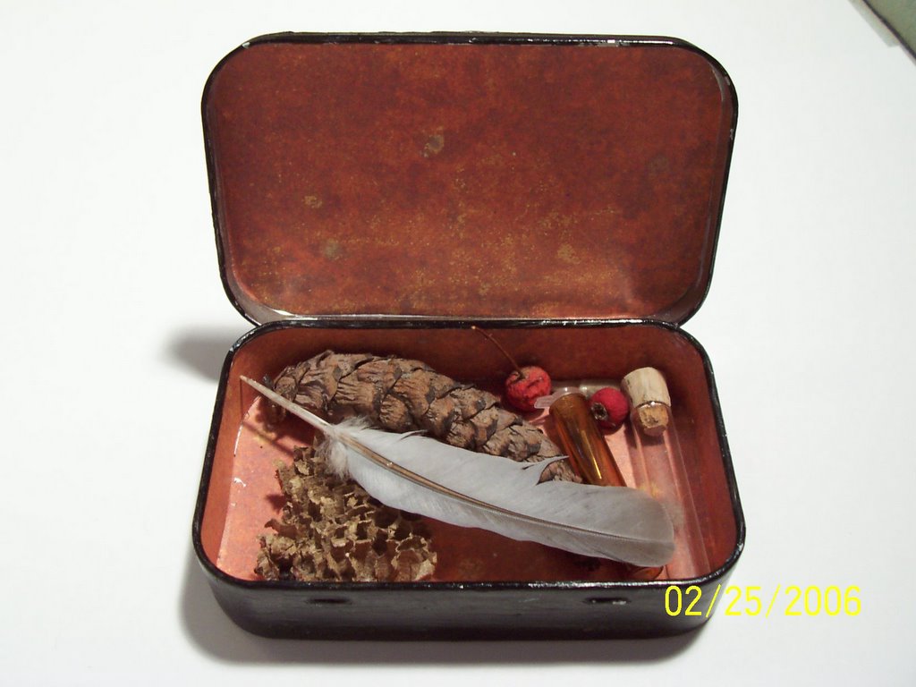
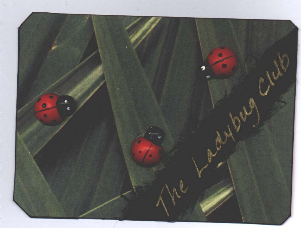
These ATCs are from a "nice bugs" swap. We were to do one each of a ladybug, a butterfly and a dragonfly. True to my usual MO, I did more than the required number and then chose the ones I liked the most to send. The Ladybug Club was admittedly a little "cute". That's not my normal style, but it's what goes on in my imagination when I look at it that makes me like it so much. I used some of my son's craft materials to make it and my only intent was to have fun with it, which I did. When I stuck those little wooden bugs on there they looked like they were having some sort of clandestine meeting down in the grass. It made me think of Victorian ladies clubs, so I thought they needed their own club name. I thought about calling it "The Ladybug Luncheon", but that brought to mind images of these very ladylike bugs wearing their best hats and sipping tea while gorging themselves on aphid tea cookies and little aphid cakes. (I can't quite get that image out of my head, so it will likely become a drawing in the future! I keep imagining it as a Tim Burton-ish sort of cartoon in my head.) That thought reminded me of the "Ladies Sewing Circle and Terrorist Society" buttons and t-shirts. Now every time I look at those cute little ladybugs I can't help thinking of them as little tea sipping, aphid munching terrorists and it cracks me up. (Aren't you lucky! You get a tiny peek inside my warped mind when you read this blog!)

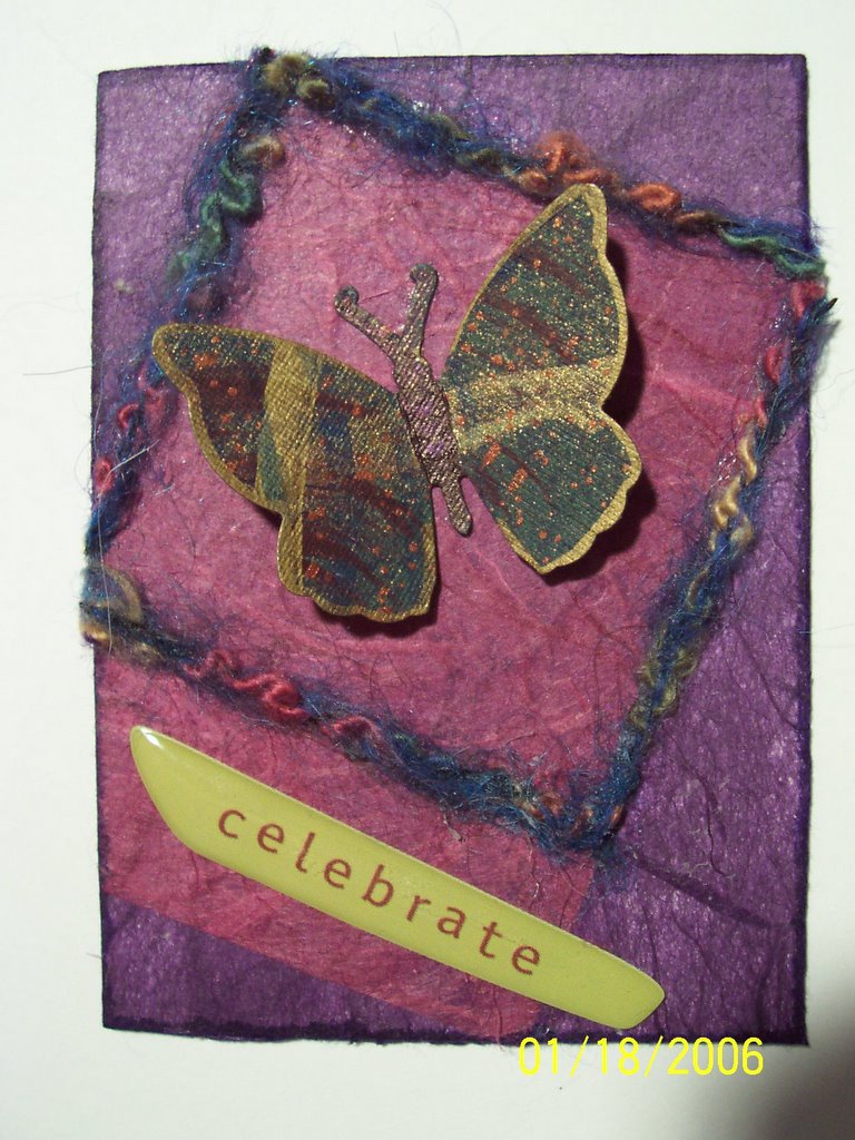
I LOVE the butterfly on the "Fresh Color" card. I handcolored it with oil pastels and really liked the way it turned out. It kept telling me it wanted a purple and green background. I wanted the background to be subdued so that it didn't compete with the butterfly. The dark purple rice paper was perfect behind the butterfly. It really made it stand out, but the design needed something more. I had some plastic "grass" dividers that my son and I saved from our sushi boxes, so I added one of those to the bottom. It looked a little too stark though, so I added some lighter grass strokes behind it with colored pencil and darker grass strokes on top of it with permanent marker. Better, but it *still* looked like it needed something else, so I added the "fresh color" sticker. It's the only element I'm not sure about, mainly because the texture of the plastic grass keeps it from looking as clean as I would like, but the overall card is pleasing even if it is a little less detailed than I usually like. Most of the cards I do with butterflies on them are only attached at the body and this one is no exception. It's wings are actually lifted off the background when it's not flattened by the scanner.

And last but not least is the dragonfly. It's my favorite of the these cards because this is the way I see dragonflies in our summer garden. Our house is on a lake so during the summer months we see LOTS of dragonflies and damselflies flitting about the gardens. They are so fast that when I look up from my gardening all I usually see is an outline silhouetted by the sun. I've been experimenting with various cut paper arts lately, so I assembled the dragonfly from various cut papers. I placed it on a background that was created on turquoise rice paper with a textured rubbing plate and a yellow oil pastel. I added a little white pencil and gold ink to accentuate the yellow rays and then decided that if I added any more detail I was going to lose the effect I was going for so I stopped. I had already lost a little of the silhouette effect by adding the gold ink. The thing that doesn't come through on the scan is the fact that there is a glittery element to the card. The thin rice paper I used for the wings has flecks of silver and the gold ink catches the light as the card is moved. It really adds to the overall feel of the card and reminds me of the glittery, flitting creatures in my gardens.

Saturday, February 11, 2006

Celebrate

This ATC was made for a birthday swap. As is usually the case with art made with metallic inks and/or fibers, the image quality is poor but I still wanted to share it. The design was simple but I absolutely loved the colors scheme. The butterfly is only attached at the body, so the wings actually move.

Friday, February 10, 2006

I'm becoming my mother!


These fun cards were from a swap entitled "I'm becoming my mother!". They aren't the most "artistic" cards I've made but I liked doing them. And yes, the kids are mine...but not the horse.

I decided to update this entry because few of the people who read this blog will know me or my family well enough to know that I'm NOT SERIOUS about these sayings! I don't actually say any of these things and quite frankly neither did my mom. Everyone knows them though, don't they! When I did some of these cards I was trying to portray the *fun* side of these often repeated sayings. That's why I used the colors I did. I wanted them to feel bright, vibrant, childlike and FUN! While doing some of them I was thinking about how obviously silly those saying are. (Has anyone's face *really* ever frozen like that?) "Don't play with your food!" is one of my faves though. How could I look at the sheer JOY on that child's face and tell her to stop!

Sunday, February 05, 2006

Mini Egyptian


These were a couple of minis made for another ATC artist's birthday. The background is cardstock layered with brown rice paper. I added a hand made paper with gold accents on top of that and then a layer of papyrus. The images were cut from a book and embelished with gold and black ink.

Cat Sketch ATC


This card was done for another ATC artist's birthday. The background is an old watercolor done on watercolor paper that I cut into ATC size pieces. I glued thin rice paper over the painting, let it dry, then drew the cat in watercolor pencil. Then I went over the whole thing with a thin wash and touched up the background with a little more green so the eyes would stand out a little more. I think of it as more of a sketch than a finished piece, but I liked it enough to pass it along.

Wizard Minis


The bottom two came out very dark in the scan, but these are the minis (1 1/2" x 2 1/2") that I just sent out for a swap. I'm feeling iffy about these, especially that third one. The colored pencils I was using were giving me fits, especially on the right side of the card. They just didn't want to stick to the painted background. I pasted a layer of thin tissue over it and redrew it which helped some but not enough. His hand came out all wonky after redrawing it so many times. I really dislike this one now that I look at it again but it's a little late to change it now since I already put them in the mail! I did a couple of others in this theme but hated them even while I was working on them. These are the four that made the cut I guess. The fourth one was a Harry Potter-ish one that I tried just to see what it would turn out like. Rather bland, but not completely terrible. I think the Alchemist one (the second one) is my favorite but I'm not in love with it either. Funny how I think I'll love a swap theme and end up feeling more or less indifferent about the results while other themes I don't think I'll like and end up loving.