Dancing Dove Creations

Monday, June 26, 2006

Mother's Touch

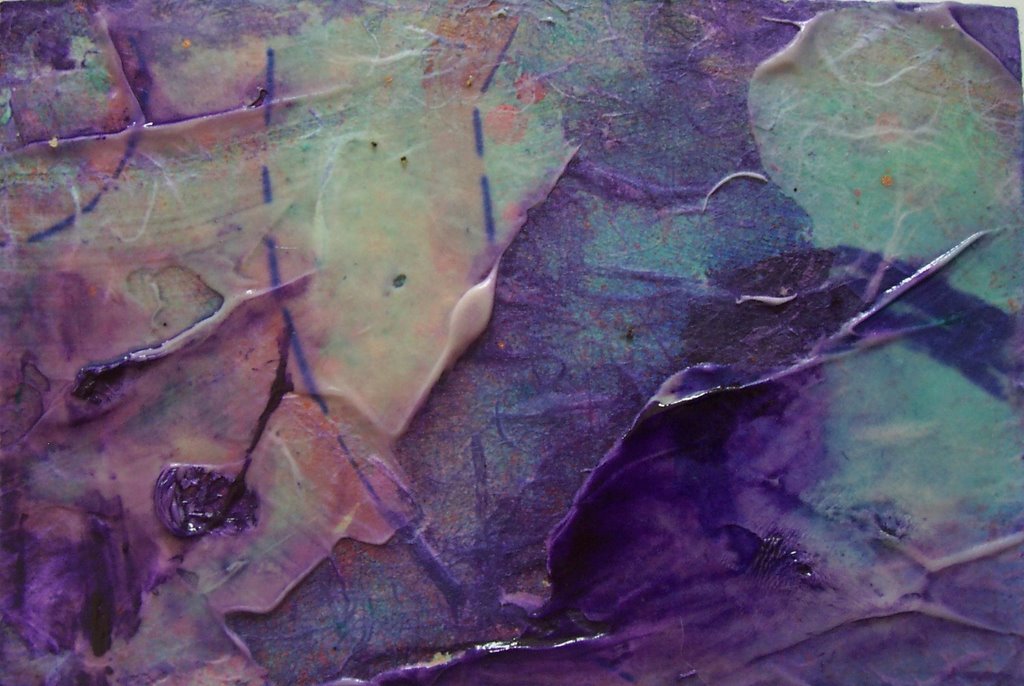
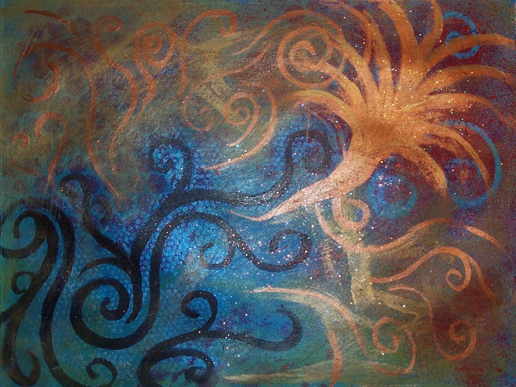
I just finished this 9 panel ATC set for a swap. I sketched out the hand and the various parts with a sharpie marker and then painted it with acrylics. I wanted it to have a "homemade" quality to it, so I made the brushstrokes obvious and didn't try too hard to make things neat, letting one color overlap another and not worrying if washes were dry before adding the next. I was actually thinking of illustrations from the 60s and 70s when I was sketching it, specifically the cover of a diary I had when I was a child and the old Clairol Herbal Essence shampoo bottle. That was what my mother always used when I was a kid and I remember burying my face in her hair and breathing in the scent of it. I miss that original scent and that funky green color it used to be!

I call this piece (or pieces if you will) "Mother's Touch". I would hope the reasons are obvious. I was specifically thinking about the way my mother raised me and the way I am trying to raise my kids. There are things that I choose to do differently, but overall I'm raising my kids much the same way I was raised, not out of blind devotion to her parenting methods but because much of what my mother did makes sense to me now, although sometimes for different reasons.

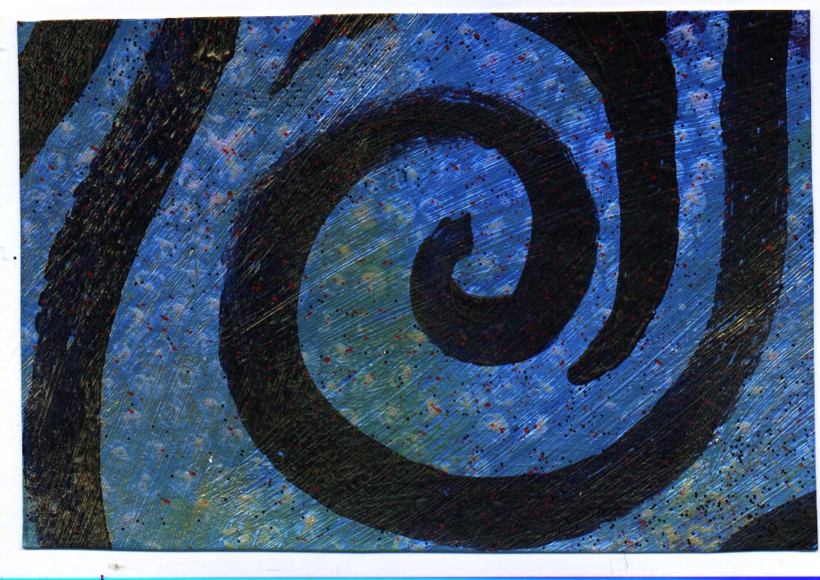
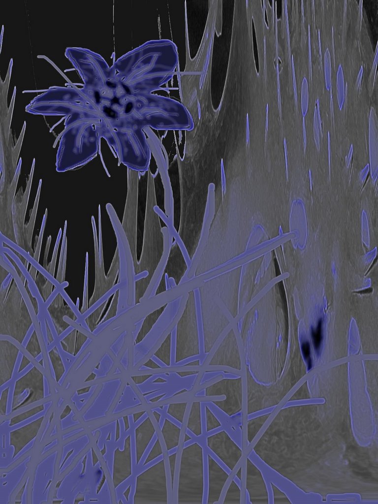
As for the symbology in this painting, the hand is based on my own but is also representative of my mother's. The lily-like flowers on the back of the hand stand for feminine wisdom - mother wit, if you will. The poppy-like flower straddling the middle and right hand bottom cards represents me and my growth as a person because of my own mother's loving guidance and because of my own mothering journey. The three hearts in the bottom right panel are me and my kids and the music below them is representative of my mother's influence, always in the background like the soundtrack of our lives, whether she is physically present or not. In my mind, music notes were the only possible symbol for my mom in this painting since she is always humming or singing and has always done so as far back as I can remember. Her singing and humming are some of my earliest memories.

The ladybug is the only touch of sadness in this painting for me. You know the old rhyme "ladybug, ladybug fly away home"? That's why it's there. I always wondered what the ladybug in that rhyme felt when she went home to find that her children were all gone. I always thought it was a horrible sounding rhyme and felt sad for that poor ladybug mama. Losing my children is the worst thing I can possibly imagine. That thought lingers in the corners of my mind and is often the thought that urges me to make every day the best, most loving day I can, because we never know which day will be the one that will later be known as "the last". That tiny little ladybug is like that tiny little thought, only occasionally drawing attention to itself with a little flash of stop-sign-red wings, but ever-present - a message from the spirit to stop and pay attention.

The rainbow coming from my heart is representative of both the love I feel for my children and the whole spectrum of beauty and wonder available to us in our joyful lives. The happiness that being a mother brings me overflows into the world around us. It's like that saying "if mama ain't happy, ain't nobody happy", but not in the negative way that most people understand it. If you see that phrase in a positive light, it means that the joy in our home starts with me. My mood affects the moods of those around me, especially my children. My perceptions literally color the world around us. If I see the joy and wonder - the *good* - in all that surrounds me, and if I express that energy in my interactions with my children, what glorious lives we all have!

There are also representations of both night and day for that 24/7 aspect of mothering. Parenting doesn't end when the kids are sent off to bed in our house. Being present and available for my kids is a round-the-clock necessity that started the moment they came into our lives. It started with birthing, breastfeeding, sharing sleep, and keeps going through nighmares, night time talks, and more and will stay that way in one form or another until our earthly relationship as mother and child is no more. Mother's are never "off duty" even when we aren't physically present. Some part of our hearts and minds are always with our children in one way or another, all day, all night, every day, every night, forever and always.

The rather hippie-ish peace sign with flowers and "love" I feel are pretty self explanatory. (What is it with me and hippie stuff lately?) I strive each and every day for peaceful interactions with my children and I knew when I started this piece that only one word would be spelled out on it - love - because that's what it all comes down to in the end - how much we loved, how deeply we loved, how *fully* we loved.

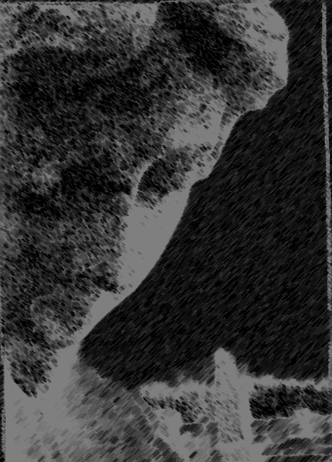
And finally there is the hand itself. The position of the hand was very important to me. I tried several different hand positions before finally settling on this one. It *looks* gentle, like someone getting ready to ever so gently touch a butterfly that has landed within reach. It looks like a hand that could never do harm, a hand that would never hit or grab. Hands are for hugging, not for hurting afterall, and the hand that I wanted to represent my own should be a gentle one.

Sunday, June 25, 2006

Rice Paper Demo Paintings


I made these two paintings this week to use as demo pieces on the ExperimentalAcrylics list. In order to give each other ideas to keep the creativity flowing we have been volunteering to put a demo or challenge on the list each week. I volunteered to do a rice paper overlays demo this week since that's something I use fairly frequently and therefore have some knowledge of. I used two of the 4"x6" pieces that I cut from the paint along painting that I overworked as the bases for these paintings.

The purple one was created by adhering plain white rice paper to the background painting with matte gel medium and letting it dry. Then I added fine pumice gel to some areas with a palette knife and let that dry. Finally, I went over the entire painting with several washes of violet, blue lake, viridian and a touch of crimson and then blotted a few spots to create the lighter areas.

For the other painting I used a spiral patterned "lace" paper instead of the plain rice paper I usually use. After it was dry I went over it with several washes in the same color palette as the first painting just much more thinned out. I let it sit for a few minutes then blotted the entire painting to lighten the colors even more. I then went over it with a thicker wash of gold, which I let run pretty much wherever it wished, and then I spattered and dabbed in a bronze colored paint straight from the tube. The wrinkled areas were created almost as an afterthought. Before the painting was dry I remembered using the microwave to quick-dry some ATCs a while back and having the paint bubble up. I liked the effect so I decided to pop this one in the microwave just to see what would happen. The places that were still wet bubbled up nicely so I pulled it out and quickly pushed the bubbles down to create the wrinkled effect. This painting is actually more textural in real life, and the purple one is a bit darker "in person". These are probably destined for a swap in the near future, but I liked both of them enough to briefly consider keeping them.

Friday, June 23, 2006

4x6 Abstracts


I ended up taking that painting that I did for the paint along and cutting it up into 4x6, ATC and mini ATC sized pieces. These are a few of the 4x6s that I swapped out this week from that painting. I left some of them as they were in the original painting, like the blue and the red ones in this set, while others I added a little to in order to make them a little more interesting. The one with the gold swirls, for instance, was enhanced with permanent markers. I really liked how I could get several different "looks" from the same painting by creatively cropping and cutting. I also like the fact that because it was painted on paper it was easy to recycle into other things. I saved all the scraps that were left over after cutting up the painting so that I could use them in collages. I don't think I'm going back to painting on canvas any time soon! I was using watercolor paper because I couldn't afford canvas for a while, but I'm finding that painting on paper has its advantages. And speaking of paper, I was running low on wc paper and went to the store to get a few sheets. While I was there I picked up some paper specifically made for acrylics. I figure I'll give it a try and see which I like painting on better.

Wednesday, June 21, 2006

Digital Play


I've been playing around with some of my photographs lately - altering them in Photoshop to come up with different effects. Some of them I've been using for ATC material. I'm especially fond of some of the cemetery photos I've taken as well as some of the ones of my son. (He's so expressive that he makes a great subject!) These are a few of the results of my digital playing. My son and I both thought the altered photo of him playing around with his spiky ball over his head was pretty creepy. The alien flower was made by taking that same photo and altering it to create the background (notice the spikes?), then drawing the flower in over it with the brush tool. The two cemetery photos are yet more pics of one of my favorite pieces of cemetery art. It resides in a local cemetery and has been the focus of several of my pieces of artwork. I like the composition of this photo so I thought I would play around with simply changing the photo slightly to alter its feel. I have loads of these, each slightly different, and the majority that I've printed to use in swaps are entitled "Beloved Shade" because this particular piece of cemetery art always brings to mind the quote "Beloved shade, perhaps now hovering near/ Oh! Let your spirit whisper in my ear". You can't see it in this photo, but the reason I think of this particular quote is because she has her right hand up near her ear as if she is listening for some soft sound that only she can hear. She fascinates me so I just keep using her.

Monday, June 19, 2006

The Power of Love


The hippie in me just loves these cards! I've made several cards with this quote. Not all of them have flowers and butterflies, but they have all had tie dyed backgrounds. I wish I could say that I tie dyed them myself, but I can't. I bought a pack of decorative papers that had a tie dye theme (with a different pattern on the front and back of each piece) for the kids to use in their crafts. They never made it to the kids though. I used a piece to make a new spirit board and then used a couple more as ATC backgrounds, then somehow the whole pack ended up in with my collage materials. They're not the fanciest, most artistic cards I've ever done, but they are happy, make me feel good cards none the less.

Sunday, June 11, 2006

Some older crochet pieces


I was talking about these pieces on a couple of crochet lists, so here are the pics. The flowers are thread crochet. I made them for my sister and mom last year for Mother's Day. The baby blanket is the Pound of Love hooded baby blanket pattern. It worked up quickly and beautifully! And the sling is my own design, but it was based on these:
http://www.sleepingbaby.net/jan/Baby/crochet.html
http://kanggah.com/cheap/sling.html

Monday, June 05, 2006

Paint Along - Final Painting


Well...here's the final mess, er painting. I liked the painting up until the final step and then I blew it. In the final step we were to add color by "printing" with the paint by putting it on a foam plate or something of that nature and pressing it onto the painting. I knew what I wanted to do but the paint just didn't want to cooperate. I realized it as soon as I put paint to paper and tried to clean it off but it just didn't want to budge. So, in an effort to salavage what I could I scumbled the yellow, white, gold mixture that had smeared so badly into other areas. It still needed something else so I started painting more swirlies in a bronzy-gold color. Then another disaster struck. I got a huge dribble of paint near the right hand corner that most definitely did NOT fit into my plans! I ended up painting that big fireworks looking thing there to cover it up. I hated having to cover up the masked shapes that I liked. ICK! Can you say OVERWORKED! Oh well, maybe it can be cut up to use for backgrounds in other pieces.

Sunday, June 04, 2006

Apron Strings


This is "Apron Strings", an ATC that I made for a private swap. It's one of my most favorites from the last month or so. I love the way the frayed ends look like they are reaching for each other in places, as if they would weave themselves back together if only they had the chance. While making this card I was thinking about how moms are encouraged to "cut those apron strings", yet those same moms who follow that advice and separate from their kids prematurely are often the ones who yearn to have those "apron string" days back later on. What if we didn't cut them? What if we encouraged our kids and trusted them to let go when they are ready instead? Would we still yearn for those early years or would we be content to know that our kids moved on when the time was right? Maybe all is well and we don't need to cut the apron strings in order to let our kids fly.

This piece was created on illustration board using acrylic paints, rice paper, cotton trim and gold and black inks.