Dancing Dove Creations

Sunday, September 24, 2006

Alien Cards


These are two of my alien themed cards. They are abstract images made by swirling, dribbling and finger painting with acrylic enamels. (Yes, "real" artists finger paint! It's not just for kids and really frees up your creative mind.) The scan of "Red Alien" turned out great, but "Abduction #1" looks very dark. The background looks black-ish but it's acutally purple and green. Once again, the names for these paintings came from what I was thinking about while painting. A friend of mine and I had been talking about various "unexplained phenomena" and talk got around to alien abduction and frontal lobe stimulation and that's what I was thinking of when I made these. Is it any wonder that I saw aliens and UFOs when I looked at them?

Friday, September 15, 2006

Sleeping Spot


This is "Sleeping Spot". It's one of my cemetery art photos with a distressed/stained tissue paper "frame". The crescent shapes in the corners are actually blue rhinestones. Not anything terribly time consuming, but I didn't have much time for art that day. I like it okay as is, but it's another theme that I'm putting in my mental file to use again, perhaps for an even better piece. Love that name...sleeping spot. It stirs up lots of possibilities for me. (The sticker came from a page full of cat oriented stuff by the way. Think outside the box!)

Thursday, September 14, 2006

Celtic Knot


I haven't posted much on here recently so I thought I'd post one more. This is a celtic knot ATC that I just finished last night. I drew the original design on some mulberry paper a while back. I had the mulberry paper lying on a piece of white paper and the markers I was using bled through onto the white paper. I loved the way the colors bled through in some places and left an almost antique looking image, like old paint flaking off an ancient church wall. I've kept that bleed-through image for some time and finally decided to do something with it. I enhanced some of the black outline every so slightly and then used watercolor pencils to darken the background. And finally I added a brighter gold color over the old gold areas to suggest multiple layers of paint. I really liked the way it turned out and hope the recipient enjoys it.

Misery


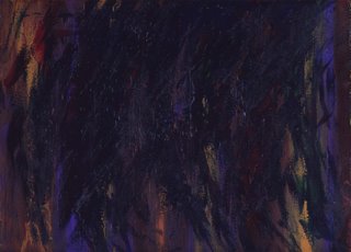
This is a pretty dark scan, but then it's a pretty dark piece. It's difficult to see the colors of the paint, especially the reds which were an important part of this piece. I felt that the deep reds, which reminded me of blood, represented my life force and my emotional wounds that were being swallowed up in this feeling of *misery*. I felt like I was being *engulfed* in waves of dark water. I was having one of those days when it feels like nothing is right, like no part of my life is where I want it to be, and I can't see a way out of it. I hate days like that. I have suffered from depression in the past and days like that remind me just how horrible it feels to be depressed. I never want to sink down into that bottomless pit again, but on those days it feels like that's where I'm headed. It's aweful. I didn't used to let myself express those feelings. My thought was that if I "fed" that part of me by acknowledging it, it would take over and I would be swallowed up again...and who knows if I would be able to pull myself out again? That's a scary thought for me. But in reality I have found the opposite to be true. If I let myself really *feel* those feelings, if I let go and let myself go deep into them and really *express* them, I feel lighter and can move on. One of the best ways of dealing with negative or overwhelming emotions for me is to "paint them out". I find that encapsulating those feelings in paint on paper gets them *out* and as soon as the painting feels "done" I can breathe again. Just looking at this one, I feel myself wanting to take deep, nourishing, soul healing breaths. It's a very *healing* painting for me. I don't think this one is going anywhere.